")
A couple of people were asking me for something like SlidingMenu, but it think SlidingMenu can get a bit difficult for some people to use. What I’ve done is created something similar to Google Play’s partial fragment screen. I”m not entirely sure how other people are doing it, but I got it to work pretty reliably without a major hassle with ViewGroups and the like. Let me start off by reiterating that almost all display options on the application are optional.
By default, I believe I’ll set the margin between 48dp and 96dp (so… 72dp?). For this example, I’m showing the the Light theme, which is pretty much the same thing as the dark theme, with the opposite Holo colors (instead of holo_blue_light, holo_blue_dark). I’m not sure if it’s as pretty as dark. Maybe it’s the colors or just the fact I prefer black. Maybe it’s the fact, by default Light background doesn’t use a gradient for a background.
I’m setting the dp to 144dp to really show off the effect. I’ve written a custom SeekBarPreference and it looks like this:

The minimum is 0dp (off), max is 192dp and increments are 8dp.
The XML for this preference is written like this:
<org.shortfuse.hermes.SeekBarPreference
  android:defaultValue="0"
  android:key="pfContactsListRightMargin"
  android:max="192"
  android:text="dp"
  android:title="@string/pfContactsListRightMargin_title"
  seekBar:increment="8"
  seekBar:min="0" />
So it’ll pretty easy to make a seekable preference from now on.
Here’s how it looks in portrait view. Just remember I’m exaggerating here for effect.

Here’s with the option off and in dark:

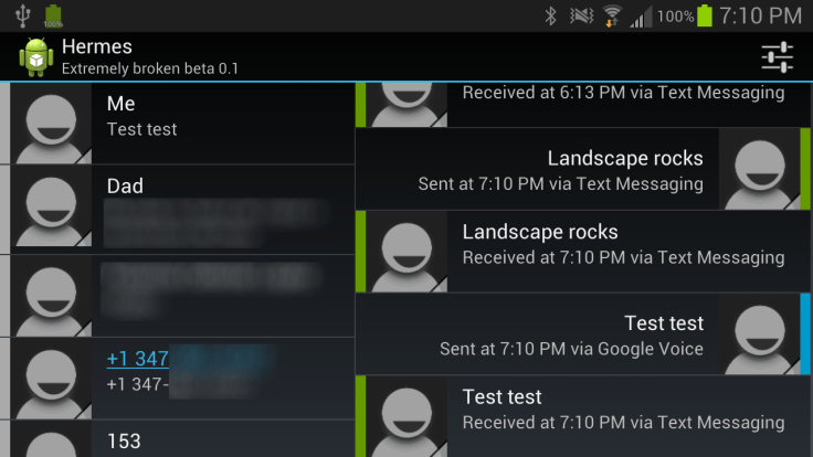
The color on the right hand side of the contact is the “Unread Indicator.” I figure having the number of unread messages seems kind of silly, since regardless, when you flick over, they will be marked red. The color is based on the IM service. Seems silly now for just SMS and GVoice, but when you start adding more services it won’t be as needlessly colorful. I’m not sure if I want to move this to the immediate right of the contacts icon instead all the way on the lefthand, since I don’t like the colors clashing on the right hand side.
I just realized I haven’t considered putting the last message time in the contacts list.
Oh well, I’ll think of something.
Mock ups and suggestions welcome.
Edit: Portrait is okay, but totally awesome on landscape. I also moved the color indicator to the other side with gray as no new messages. Check it out:
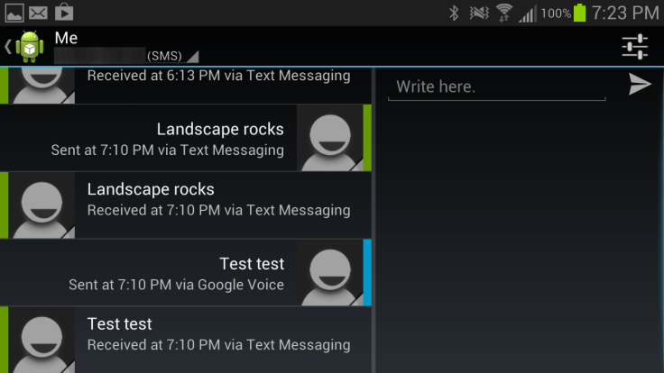
You can manipulate both lists simultaneously. Slide to the right and you’ll see the text entry box like in the other pictures.
This means forwarding messages is going to be a lot easier, since you can select/copy messages on the right and hold and “paste & send” to the contacts on the left.
You just slide to the right to get to your edit box.

And finally you’ll reach your normal messaging window:

Leave a comment