")
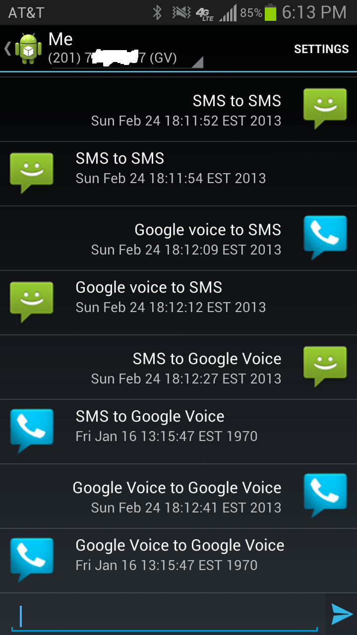
Here’s a very preliminary UI design for messaging. It’s modelled (read: stolen) from the stock MMS XML. I’m going to change what the status text says since the full date is just a placeholder. The icons signify “Sent via” and “Received via”. Here I’m messaging myself. Take a look at how long it takes to receive a sent message. Yeah, it’s much faster than Samsung’s implementation.
Edit: just noticed Google Voice incoming has wrong date. Beta indeed
I also find showing the contact picture EVERY message is ridiculously redundant while the service icon is both informative and provides a comfortable minimum spacing for touch input. The spinner in the top left changes the destination.
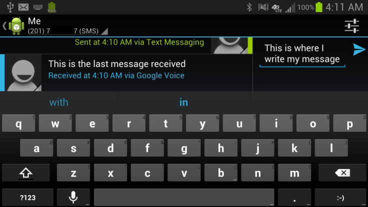
Oh yeah, dark theme is beautiful. Light looks boring by comparison.
Oh and that “Settings” text will be replaced by your standard “Gear” icon but I haven’t got around to doing so. From there I’ll add the “Add” button for MMS stuff.
You can get back to contacts by pressing back, the “up/home” button on the top left or, since this is a view pager, swiping to the left.
This was posted via my phone just now.
EDIT: I’ve made some more changes you can see here as per suggestions in these comments. I’m including a screenshot here since this post hit Reddit recently.

Leave a comment